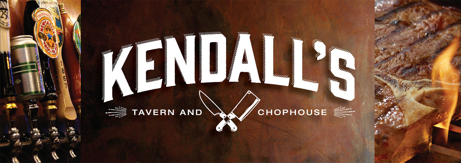
Kendall's
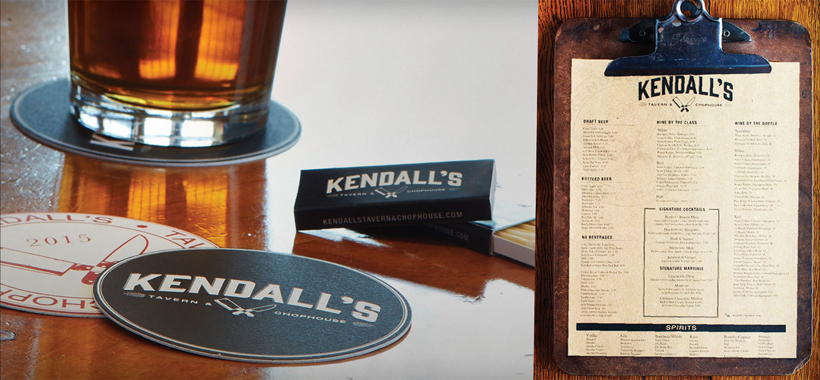
This client was asked to turn around a low performing restaurant positioned in a hard to find location. They came to us to build a brand that would produce measurable results. Each touchpoint was based on deliberate research and meaningful insights to produce a brand the truly delivered on the brand promise.
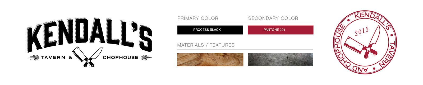
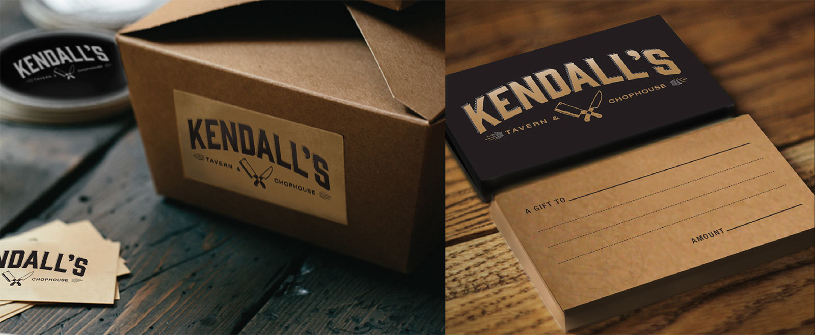
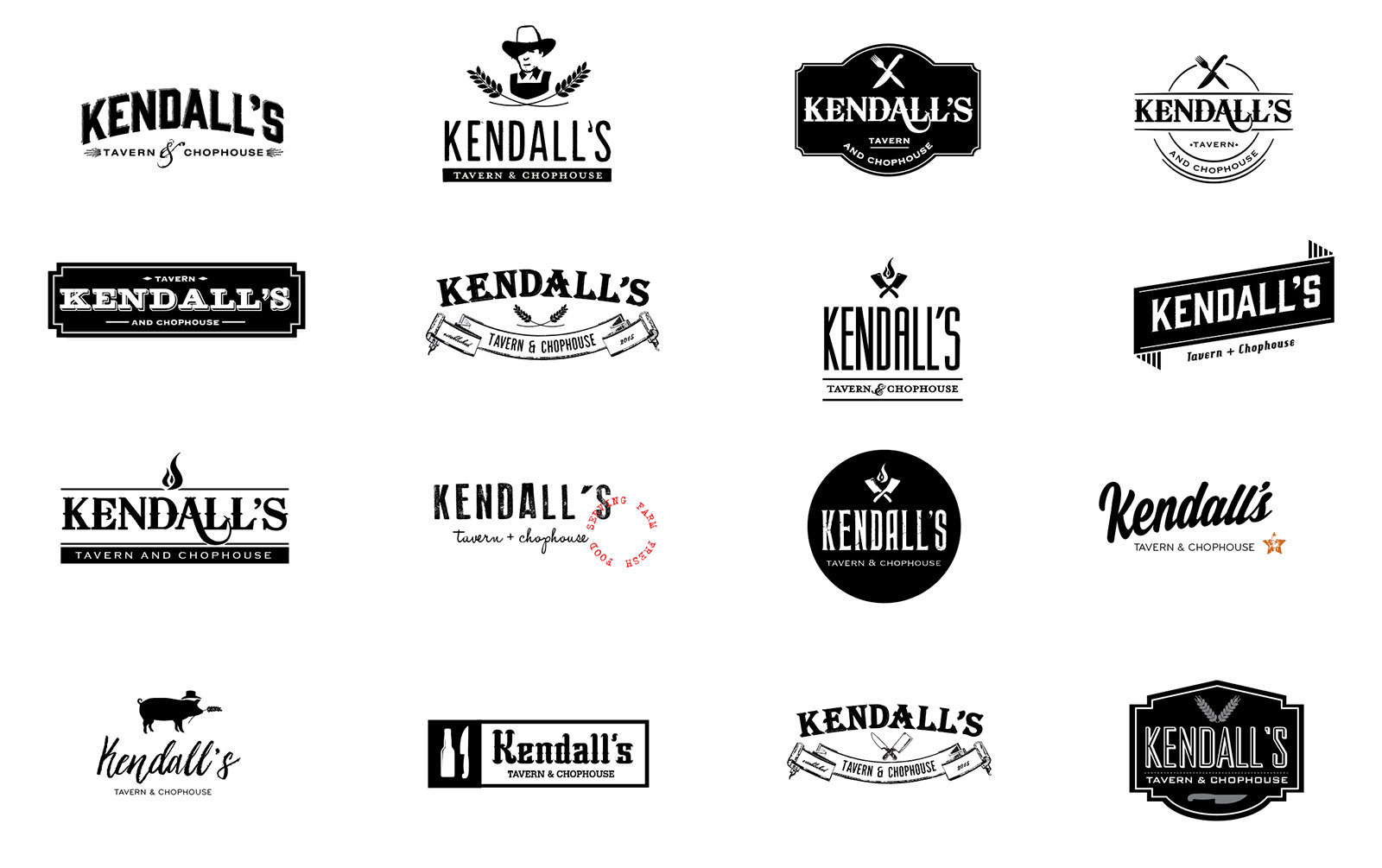
The name, Kendall’s, was the original owner of the land. The unique decision by the owner to have the menu designed for both a tavern and chophouse is reflected in the logo, brand standards, copy tone and the authenticity and neighborhood feel.
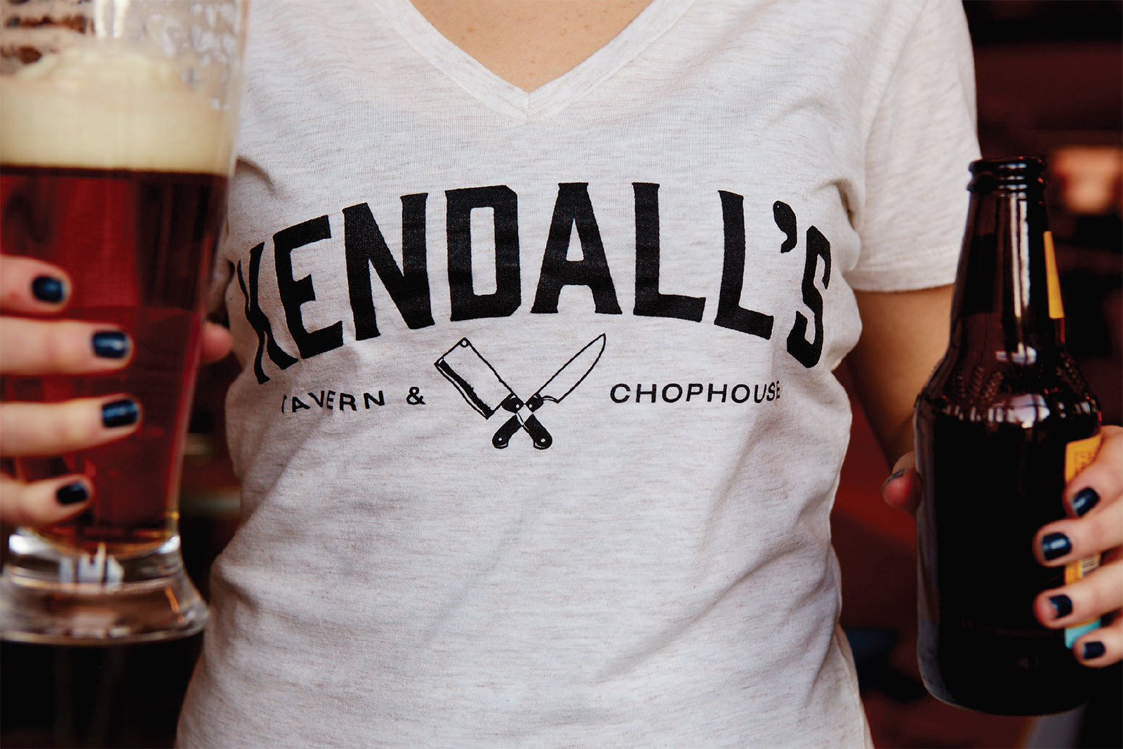
The Photo style, art direction and OOH billboard campaigns were chosen to separate themselves from the chain-restaurant feel and to reflect an authentic experience that delivers quality and consistency.
There was an astounding 19% revenue growth the first year of business and added growth of 4% the following year. Kendall’s continues to outperform their predicted goals year after year.